Branding | C&J Fest.
Branding and art direction for Crime & Justice Festival in Melbourne


Crime & Justice Festival is a successful Melbourne literary event that celebrate high quality crime fiction and writing on issues of social justice.
The annual event runs over three days at a variety of venues around Melbourne city that has already ten years history. Compared with the success on the business side, the visual part of this event has far more lay back. The logo was just typo set as “C&J” by a generic serif font. The organiser sought to redesign the logo, in order to catch more attraction from the readers and media by the refresh branding.
One of the primary goals was to reinvigorate the brand identity and optimise its performance across various platforms, and bring visual continuity and connection across the crime fiction and target audience. The challenge for this design project was strengthening all the fictions about crime fiction to make visual impact, and avoid cliché such as blood stain, and creepy vibe.
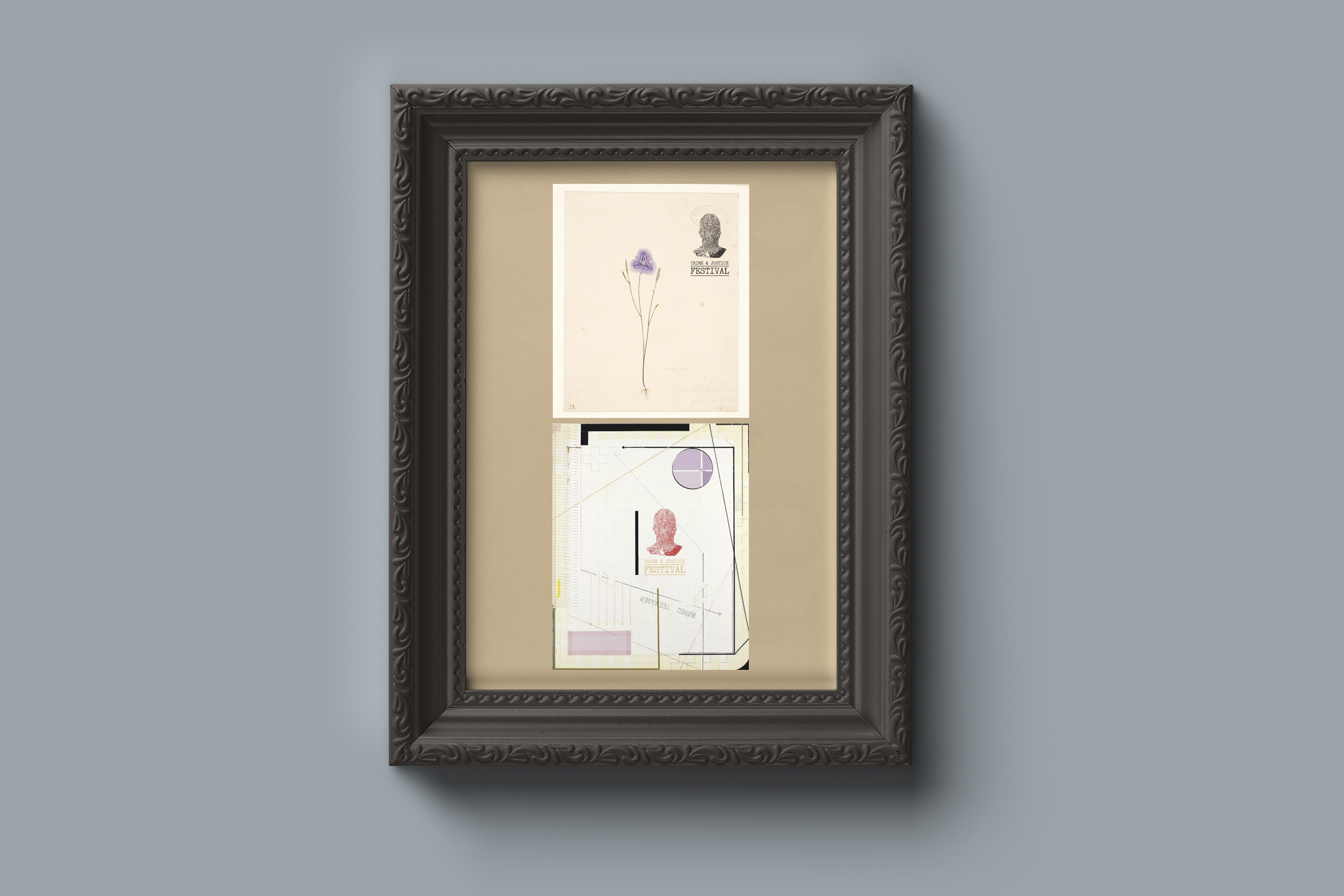
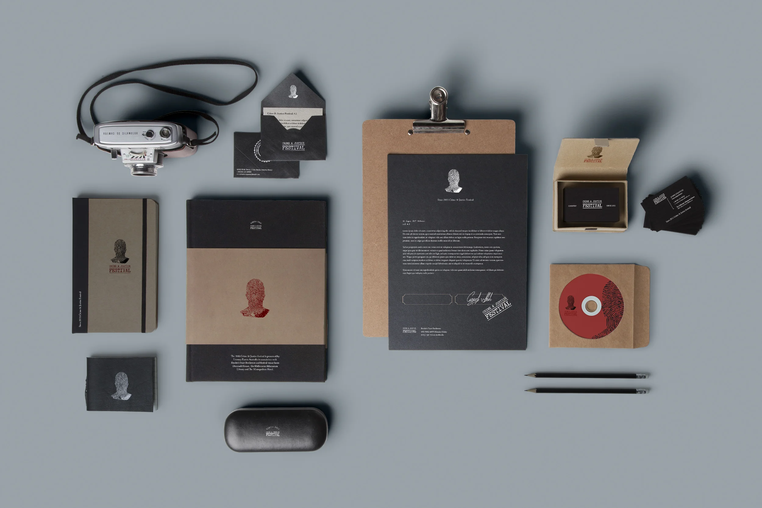
After reaserch and brainstorm, a new logo which combines the silhouette of mysterious charactor and the confidential archive stamp has been introduced to the event. The fingerprint silhouette have been carefully delivered as an event clue throughout the venues and streets. The new grey tune colour pallets also define the special atmosphere to pass the remarkable heritage of Melbourne C&J readers community.
