Branding | PIYO PEN
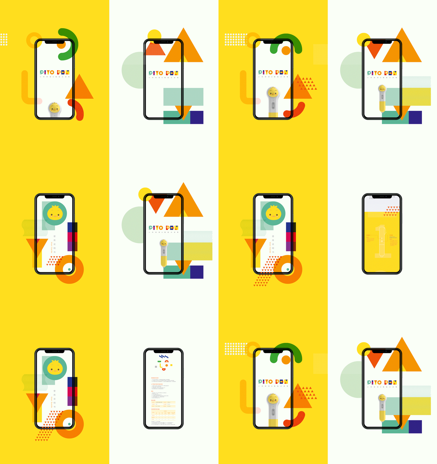
Back to the basics, with Circle, Triangle, Square and Dot. Kenn created a PIYO PEN visual language based on essential elements and primary colours, that emphasise this smart device's uniqueness and gives the brand more visual possibilities on all its touchpoints.


Back to the basics, with Circle, Triangle, Square and Dot. Kenn created a PIYO PEN visual language based on essential elements and primary colours, that emphasise the pens uniqueness and gives the brand more visual possibilities on its touch points.
Design Challenge
There are many similar children's pen reading products on the market. It is a challenge to make the brand design stand out. The challenge for the designer was to create a brand new clean, smart, engaging, playful and warmth image for the target market. The predominant challenge was to redefine the brand in the entire product line so that it can be easily applied to different scenarios and facilitate the subsequent extension of use. Consciously focus on sustainable design, use eco-friendly materials, simplify graphic information, and digitalise all the related information as much as possible (eg: online interactive instructions book).
Design Solution
The inspiration came from Composition II (Piet Mondriaan, 1930), cosmos in shorthand, visual DNA of the Universe.
Back to the basic, Kenn developed a PIYO PEN visual system based on three primary colours, lines, dots, triangles and squares. The clarity of the colour symbols helped to refine, and favourably highlight the LRB’s visual identity and marketability.
The humanistic approach extends to the use of illustration, which added a smart, warm, playfulness and a sense of AI connectivity beyond the kids loving and engaging with books. Use abstract illustrations as a secondary visual tier to elevate the LRB’s selling points.
Design Impact
In a post-COVID 19 world with new physical and behavioural limitations, sophisticated but easy to operate reading and listening devices support a deepening bond between parent and child based on an intuitive interface that links back to the outside world of play orientated learning.
The unique modular design and colourful visual identity naturally propagates a warm, positive vibe and learning through the online platform. And the interactive activities have the potential to encourage bonding between parents and kids, as well as naturalise reading communities for kids.
BG
Love Reading Books (LRB) is a highly philosophical publisher that focuses on delivering high-quality children reading resources. PIYO PEN is an AI smart talking pen that can pass their intellectual contents to the audience seamlessly.
PIYO is how chicklet is pronounced in Japanese, and a famous cartoon character in the early childhood education (0-3 years) industry throughout East Assia. But the new PIYO PEN system supports a wider demographic of readers up to 12 years old. This expanded demographic gives a new meaning to the word ‘PIYO’, and the branding for PIYO PEN should therefore be smarter, and and appeal to a more diverse consumer base to avoid the naive and simplistic stereotypes associated with branding focused on the parents of infants.
The outstanding feature of the reading pen is to fill the gap in the lack of reading time for parents to accompany their children. Therefore, it is particularly important to visually stimulate the interaction between parents and children to make the interactive communication more vivid and interesting. Being both dynamic and flexible, PIYO PEN’s visual identity can be extended easily across a range of media and tailored to the young kids and their parents.
